Front Page :
Inspirations / Examples :

Double Page spread :
Inspirations / Examples :


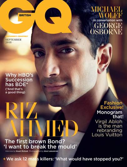
- Medium close-up shot of a celebrity (actor) to engage the audience, and by having an influential person/celebrity on the front cover it will create an interest to my millennial audience. This celebrity will be shown to be playing a homeless man in his next movie, (which will be a realist film by Ken Loach).
- Use of a clear, large font with a contrasting colour from the background of the magazine will engage the audience as the image will be eye-catching.
- Most of the writing will be in block capitals, to be eye-catching, and information about what is inside the magazine will not be.
- Use of persuasive language such as rhetorical questions will invite the audience to read the magazine.
- The background of the image will either cover the whole page, or the character/ celebrity I choose to use will be placed on a white background to create an eye catching image. I will use someone in their 20s, to target my audience of millennials aged 18-35years old.
- Yellow and white colour palette ( as it's a positive article, and subject choice); use of convergence as I will have the same restricted colour palette for my double page spread.
- Title of 'REVEAL' will be in front of the actor, and will be yellow and bright to be eye-catching and recognisable to the target audience. Also, I will follow the magazine's conventions by writing 'BRITISH' in the G of the GQ title.
- 'Insight to the meaning and inspiration behind his character' This statement will create a sense of anticipation for the reader, and will express how one of the characters in the documentary helped with the actor's character portrayal.
Inspirations / Examples :
Double Page spread :
- The article will express that the actor did primary research into the issue as well as getting to know some individuals. And the documentary I created links well with the messages the film is trying to portray.
- Use of inscription of shots of some of my characters, (stills from the documentary) to create an interest in watching the documentary, (emphasise convergence).
- To fit conventions of a lifestyle magazine, I will use/select medium close-ups shots of my characters; and will include personal information about these selected characters in my article.
- To fit the needs of Channel 5, I will create a factual tone for my article by including statistics and information about homelessness as an issue. However, I will closely follow my intentions to show homeless people as individuals, that aren't defined by their label.
- I will include some information about Jimmy's Homeless Shelter, as my audience will be based in Cambridge as the show follows an issue in Cambridge with people that live in Cambridge.
- Yellow and white colour palette ( as it's a positive article, and subject choice); use of convergence as I will have the same restricted colour palette for my front page.
- Mainly focusing on Scott's story, and his past will create a connection between the audience and the characters in my documentary. (emphasise convergence between my magazine and my documentary)
- Also have Sam's story summarised.
Inspirations / Examples :
really clear ideas, great.
ReplyDeleteThis comment has been removed by the author.
ReplyDelete